Android 常用布局容器
- Android 的 UI 可以分为两类,一类叫做 ViewGroup 容器,一类叫做 View 视图
- ViewGroup 容器:(LinearLayout,RelativeLayout,FrameLayout)都是常用常见的容器.
- View 视图:(TextView,Button,ImageView)都是常用常见的视图.
1.基础布局容器
LinearLayout线性布局:横着或竖着按顺序排列
RelativeLayout相对布局:起始坐标时屏幕左上角,以同级或上级为参考系定位位置(以屏幕的左上角为常考点来摆放它们的位置)
FrameLayout帧布局:像千层饼一样,一层压着一层(同样以屏幕的左上角为常考点来确定它们的位置)
ConstraintLayout 约束布局:google 于 2016 年新发布的一种布局方式,它不在 android 的基础 api 包里,需要额外引入
AbsoluteLayout 绝对布局(以屏幕左上角为参考系,定位自己的位置,从 android 2.2 版本后废弃)
GridLayout 网格布局(可以指定行数列数,子控件自动根据行列数进行分配位置,于 android 4.0 后新增进 api 中)
TableLayout 表格布局(类似于网格布局,以一个 TableRow 标签定义为一行或一列)
2.线性布局 LinearLayout
| 属性 | 可选值 | 说明 |
|---|---|---|
| orientation | 1.vertical:垂直排列 2.horizontal:水平排列(从左到右) | 也就是这个线性布局到底是水平方向逐个排列还是垂直方向逐个排列 |
| layout_width layout_height | 1.match_parent:填充父容器的剩余空间 2.wrap_content:根据子视图宽高自适应自己的宽高 3.自定义大小 50dp | layout_width 和 layout_height 是 android 中控件的必要属性,规定了控件的宽度和高度,这个两个属性的值可以是指定的值,也可以根据内容自适应,还可以填充整个剩余空间 |
| background | #ff0000 红色 | 填充背景色 |
| gravity | 1.center:所有子视图相对于父容器居中显示 2.horizontal_center:所有子容器的横向方向上相对父容器居中显示 3.vertical_center:所有子视图的纵向方向上相对父容器居中显示 | 决定子控件相对该父容器的位置(对齐方式的表示) |
| layout_gravity | 1.center:该容器相对于它的父容器居中显示 2.horizontal_center:该容器横向方向上相对它的父容器居中显示 3.vertical_center:该容器纵向方向上相对它的父容器居中显示 | 决定该容器相对它的父容器的位置 |
| weight | 按比例分配父容器剩余的宽度或高度 |
提示:
button 高版本改变背景色要用 android:backgroundTint 属性
android:layout_gravity 如果对齐方式和 android:orientation 方向一致就会失效
在父类中使用 子类相较与父类的布局 android:gravity 子控件使用 android:layout_gravity
orientation="vertical"时 layout_weight 等比分配高度使用 orientation="horizontal"时 layout_weight 等比分配宽度
layout_weight 则 layout_width 失效当 layout_width=“0dp” layout_weight=数字越大宽度越长
3. 相对布局 RelativeLayout
相对布局在摆放子视图位置时,按照指定的参考系来摆放子视图的位置,默认以屏幕左上角(0,0)位置作为参考系摆放位置
相对于父元素 7 个常用属性
| 属性 | 可选值 | 说明 |
|---|---|---|
| layout_alignParentTop | true/false | 是否相对于父容器的顶部 |
| layout_alignParentBottom | true/false | 是否相对于父容器的底部 |
| layout_alignParentLeft | true/false | 是否相对于父容器的左边 |
| layout_alignParentRight | true/false | 是否相对于父容器的右边 |
| layout_centerHorizontal | true/false | 是否相对于父容器的水平方向居中 |
| layout_centerVertical | true/false | 是否相对于父容器的垂直方向居中 |
| layout_centerInParent | true/false | 是否相对于父容器的水平和垂直方向居中 |
- 相对于兄弟元素 4 个常用属性
| 属性 | 可选值 | 说明 |
|---|---|---|
| layout_above | @id/控件 id | 是否相对于指定控件的上方 |
| layout_below | @id/控件 id | 是否相对于指定控件的下方 |
| layout_toLeftOf | @id/控件 id | 是否相对于指定控件的左边 |
| layout_toRightOf | @id/控件 id | 是否相对于指定控件的右边 |
- 相对于兄弟元素的对齐方式
| 属性 | 可选值 | 说明 |
|---|---|---|
| layout_alignTop | @id/控件 id | 是否相对于指定控件的顶部对齐 |
| layout_alignBottom | @id/控件 id | 是否相对于指定控件的底部对齐 |
| layout_alignLeft | @id/控件 id | 是否相对于指定控件的左边对齐 |
| layout_alignRight | @id/控件 id | 是否相对于指定控件的右边对齐 |
4. 帧布局 FrameLayout
组件的默认位置都是左上角,组件之间可以重叠。像千层饼一样,一层压着一层 可以设置上下左右的对齐、水平垂直居中、设置方式与线性布局相似。
常用属性
| 属性 | 可选值 | 说明 |
|---|---|---|
| layout_gravity | center/center_vertical/center_horizontal | 设置组件在父容器中的位置 |
| layout_marginLeft | 具体的数值 100dp | 左侧外间距 |
| layout_marginTop | 具体的数值 100dp | 顶部外间距 |
| layout_marginRight | 具体的数值 100dp | 右侧外间距 |
| layout_marginBottom | 具体的数值 100dp | 底部外间距 |
MaterialButton
- MaterialButton 是 Google 于 SDK28 推出的新控件,当遇到按钮需要圆角、或者描边等,就不必使用 xml 文件或者 Github 上找第三方库实现
1.1 依赖引入
- 添加依赖 我的项目默认添加了 material 1.4.0
- Project 文件模式下 app—> bulid.gradle
implementation 'com.google.android.material:material:1.3.0'
- app 的 theme 主题修改
# app—>src---->main---->AndroidManifest.xml

android:theme="@style/Theme.项目名"
<--!点击进入这个theme文件-->
<--!进入一个themes.xml文件-->
<style name="Theme.项目名" parent="xxx">
# 改为
<style name="Theme.项目名" parent="Theme.MaterialComponents.Light.NoActionBar">
1.2 继承关系
java.lang.Object
 ↳android.view.View
  ↳android.widget.TextView
   ↳android.widget.Button
    ↳androidx.appcompat.widget.AppCompatButton
     ↳com.google.android.material.button.MaterialButton
1.3 关键属性
| 属性 | 描述 | 说明 |
|---|---|---|
| app:cornerRadius | 圆角大小 | 设置按钮的圆角大小 |
| app:strokeColor | 描边颜色 | 设置按钮的描边颜色 |
| app:strokeWidth | 描边宽度 | 设置按钮的描边宽度 |
| app:icon | 图标 icon | 设置按钮的图标 |
| app:iconGravity | 图标位置 | 设置按钮的图标位置 start,end.textStart,textEnd |
| app:backgroundTint | 背景色 | 设置按钮的背景色 |
| app:backgroundTintMode | 背景模式 | 设置按钮的背景模式 add,multiply,screen,src_atop,src_in,src_over |
| app:iconTint | 图标颜色 | 设置按钮的图标颜色 |
| app:iconPadding | 图标间距 | 设置按钮的图标间距 |
| app:iconSize | 图标大小 | 设置按钮的图标大小 |
| app:rippleColor | 水波纹色 | 设置按钮的水波纹颜色 |
| app.iconTintMode | 图标模式 | 设置按钮的图标模式 |
根节点添加 app 命名空间
xmlns:app="http://schemas.android.com/apk/res-auto"
1.4 注意事项
去除阴影: MD 控件默认有阴影效果,但是有时候我们并不想要按钮有阴影,那么这时候可以指定 style 为 style="@style/Widget.MaterialComponents.Button.UnelevatedButton" 这样就能去掉阴影,让视图看起来扁平化
闪退: 修改 APP 主题
android:theme="@style/Theme.MaterialComponents.Light.NoActionBar"
MaterialButtonToggleGroup
1.1 继承关系
java.lang.Object
   ↳android.view.View
        ↳android.view.ViewGroup
             ↳android.widget.LinearLayout
                  ↳com.google.android.material.button.MaterialButtonToggleGroup
- 只有第一个子元素的最左边角和最后一个子元素的最右边角才能保留它们的形状外观圆角大小 app:cornerRadius 修改圆角
1.2 公开属性
| 属性 | 描述 | 说明 |
|---|---|---|
| app:checkedButton | 默认选中 | 按钮 ID |
| app:singleSelection | 是否单项选择 | true(单选)/false(多选) |
| app:selectionRequired | 是否必选 | true(必选)/false(非必选) |
1.3 tab 切换监听
- MaterialButtonToggleGroup 继承 LinearLayout 可以使用 weight
- 在 comps_material_button.xml 写布局 在 MainActivity.kt 写监听
TextView 文本控件
1. 常用属性
| 属性 | 属性值示例 | 说明 |
|---|---|---|
| android:id | @+id/tv | 设置一个组件 id,通过 findViewById()的方法获取到该对象,然后进行相关设置 |
| android:text | @string/xxx | 设置文本内容 |
| android:textSize | 20sp | 设置文本大小 |
| android:textColor | #ff0000 | 设置文本颜色 |
| android:gravity | center | 设置文本对齐方式 |
| android:background | #ff0000 | 设置文本背景色 |
| android:padding | 10dp | 设置文本内边距 |
| android:paddingLeft | 10dp | 设置文本左内边距 |
| android:paddingTop | 10dp | 设置文本上内边距 |
| android:paddingRight | 10dp | 设置文本右内边距 |
| android:paddingBottom | 10dp | 设置文本下内边距 |
| android:drawableLeft | @mipmap/ic_launcher | 设置文本左边图标 |
| android:drawableTop | @mipmap/ic_launcher | 设置文本上边图标 |
| android:drawableRight | @mipmap/ic_launcher | 设置文本右边图标 |
| android:drawableBottom | @mipmap/ic_launcher | 设置文本下边图标 |
| android:drawablePadding | 10dp | 设置文本图标与文本之间的间距 |
| android:drawableTint | #ffffff | 图片着色数 |
| android:ellipsize | end | 设置文本超出显示范围时的显示方式 |
| android:maxLines | 1 | 设置文本最大显示行数 |
| android:inputType | text | 设置文本输入类型 |
| android:hint | 请输入用户名 | 设置文本提示内容 |
| android:password | true | 设置文本是否以密码形式显示 |
| android:scrollHorizontally | true | 设置文本是否水平滚动 |
| android:scrollbars | horizontal | 设置文本滚动条显示方式 |
| android:linksClickable | true | 设置文本是否可点击 |
| android:autoLink | web | 设置文本自动识别链接 |
| android:lineSpacingExtra | 10dp | 设置文本行间距 |
| android:lineSpacingMultiplier | 1.5 | 设置文本行间距倍数 |
| android:maxLength | 10 | 设置文本最大长度 |
| android:singleLine | true | 设置文本是否单行显示 |
| android:shadowColor | #ff0000 | 设置文本阴影颜色 |
| android:shadowDx | 10 | 设置文本阴影水平偏移量 |
| android:shadowDy | 10 | 设置文本阴影垂直偏移量 |
| android:shadowRadius | 10 | 设置文本阴影半径 |
| android:textStyle | bold | 设置文本字体样式 |
ImageView 图片控件
1.常见属性
| 属性 | 属性值示例 | 说明 |
|---|---|---|
| android:src | @mipmap/ic_launcher | 设置图片资源 |
| android:alpha | 0.5[0.0~1.0] | 设置透明度 |
| android:backgroun | @drawable/background | 给 ImageView 设置背景色、背景图片 |
| android:scaleType | center | 设置图片缩放类型 |
- 注意: 同时设置 src 和 background。background 在下,src 在上
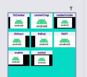
2.常见缩放类型
| 属性 | 说明 |
|---|---|
| fitXY | 把原图按照指定的大小在 View 中显示,拉伸显示图片,不保持原比例,填满 ImageView |
| centerCrop | 常用,等比放大居中显示以填满整个 ImageView 为目的,将原图的中心对准 ImageView 的中心,等比例放大原图,直到填满 ImageView 为止(指的是 ImageView 的宽和高都要填满),原图超过 ImageView 的部分作裁剪处理。 |
| centerInside | 以原图完全显示为目的,将图片的内容完整居中显示,通过按比例缩小原图的长(宽)等于或小于 ImageView 的长(宽)。如果原图的长宽本身就小于 ImageView 的长宽,则原图不作任何处理,居中显示在 ImageView |
| fitCenter | 把原图按比例扩大或缩小到 ImageView 的 ImageView 的高度,居中显示 |
| matrix | 不改变原图的大小,从 ImageView 的左上角开始绘制原图,原图超过 ImageView 的部分作裁剪处理。 |
| center | 保持原图的大小,显示在 ImageView 的中心。当原图的长(宽)大于 ImageView 的长(宽),超过部分裁剪处理。 |
| fitStart | 把原图按比例扩大(缩小)到 ImageView 的高度,显示在 ImageView 的上部分位置 |
| fitEnd | 把原图按比例扩大(缩小)到 ImageView 的高度,显示在 ImageView 的下部分位置 |
效果图
RecyclerView 高级 UI 控件
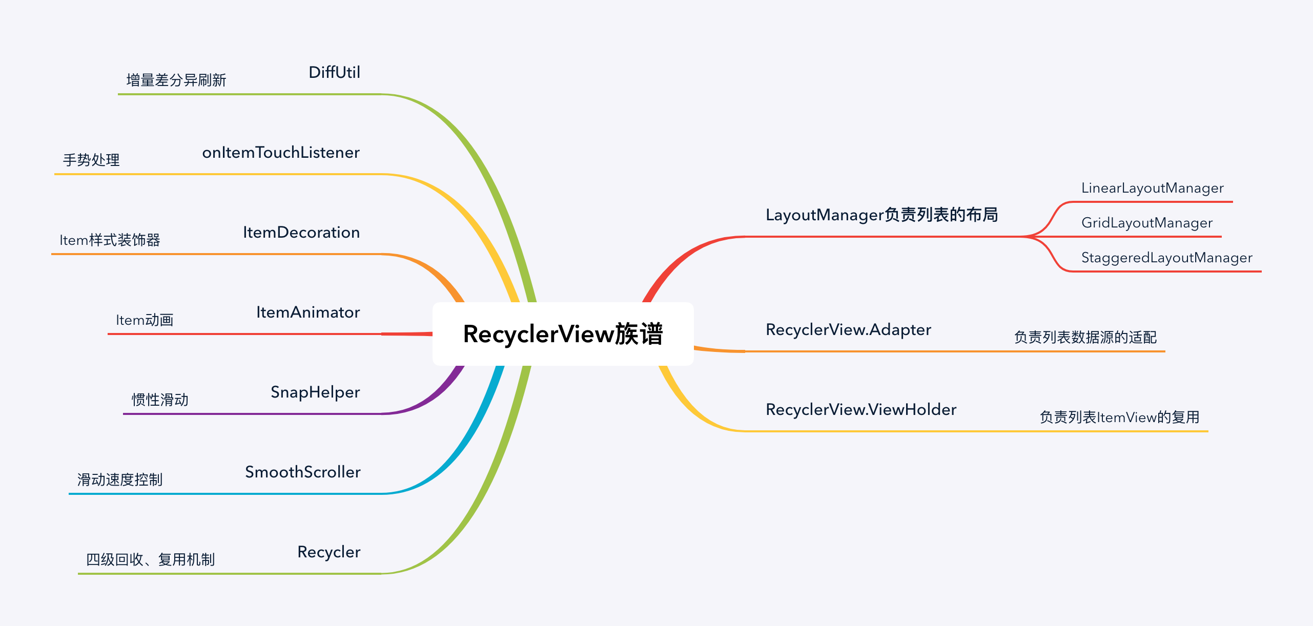
- 四层回收、复用机制可以让页面在滑动的时候非常顺滑
1. 列表布局 LinearLayoutManager
1.1 纵向列表
override fun onViewCreated(view: View, savedInstanceState: Bundle?) {
    super.onViewCreated(view, savedInstanceState)
    // 文本 布局方向 是否反转
    FragmentHomeBinding.bind(view).recyclerView.layoutManager = LinearLayoutManager(context , LinearLayoutManager.VERTICAL , false)
    FragmentHomeBinding.bind(view).recyclerView.adapter = MyAdapter()
}
1.2 横向列表
override fun onViewCreated(view: View, savedInstanceState: Bundle?) {
    super.onViewCreated(view, savedInstanceState)
    // 文本 布局方向 是否反转
    FragmentHomeBinding.bind(view).recyclerView.layoutManager = LinearLayoutManager(context , LinearLayoutManager.HORIZONTAL , false)
    FragmentHomeBinding.bind(view).recyclerView.adapter = MyAdapter()
}
共同部分
step1: 编写列表 item 的布局样式 item_view_linear_vertical.xml
step2: 完善 fragment_home.xml
- 确保 app–>build.gradle 中 dependencies 有引用
step3: 完善 MainActivity.kt
- 确保 MainActivity.kt 中有引用
- 关联 fragment_home.xml
- recycler_view.layoutManager
- recycler_view.adapter
    class MyViewHolder(val view: View):RecyclerView.ViewHolder(view){
        val binding = ItemViewLinearVerticalBinding.bind(view)
    }

    //内部类可以访问外部类的对象 为了拿到context
    inner class  MyAdapter:RecyclerView.Adapter<MyViewHolder>(){
    //创建对应的ViewHolder对象
    override fun onCreateViewHolder(parent: ViewGroup, viewType: Int): MyViewHolder {
        //资源文件id ViewGroup attachToRoot
        val itemView = LayoutInflater.from(context)
            .inflate(R.layout.item_view_linear_vertical, parent, false)
        return MyViewHolder(itemView)
    }

    //完成数据的绑定
    @SuppressLint("SetTextI18n")
    override fun onBindViewHolder(holder: MyViewHolder, position: Int) {
        //载入图片的三种方式
        /*holder.itemView.item_image.setImageResource(R.drawable.android_icon)
        holder.itemView.item_image.setImageDrawable(ContextCompat.getDrawable(context!!,R.drawable.android_icon))
        holder.itemView.item_image.setImageBitmap(BitmapFactory.decodeResource(context!!.resources , R.drawable.android_icon))*/
        with(holder){
            binding.itemImage.setImageResource(R.drawable.android_icon)
            binding.itemTitle.text = "这是第 ${position+1} 个标题"
            binding.itemMessage.text = "这是第 ${position+1} 个内容,这是第 ${position} 个内容,这是第 ${position} 个内容,这是第 ${position} 个内容"
        }
    }

    //告诉列表有多少数据
    override fun getItemCount(): Int {
        return 20
    }
}
提示:
- with(holder) 代替 holder.itemView
- LayoutInflater 与 attachToRoot 杂谈笔记
- context!! 代表 context 这个字段对象不为空
2. 网格布局 GridLayoutManager
//HomeFragment被解析为view对象时会回调这个方法
override fun onViewCreated(view: View, savedInstanceState: Bundle?) {
    super.onViewCreated(view, savedInstanceState)
    // 文本 几列
    FragmentDashboardBinding.bind(view).recyclerView.layoutManager =
        GridLayoutManager(context , 2)
    FragmentDashboardBinding.bind(view).recyclerView.adapter = MyAdapter()
}
3.瀑布流布局 StaggeredGridLayoutManager
    override fun onViewCreated(view: View, savedInstanceState: Bundle?) {
        super.onViewCreated(view, savedInstanceState)
        // 几列 方向
        FragmentNotificationsBinding.bind(view).recyclerView.layoutManager =
            StaggeredGridLayoutManager(2 , StaggeredGridLayoutManager.VERTICAL)
        FragmentNotificationsBinding.bind(view).recyclerView.adapter = MyAdapter()
    }
4.view-binding
- 可以直接使用布局中的控件 id 来操作 view 控件, 不用再 findViewById。大大提高工作效率,减少模板代码量
- 需要在根目录下的 build.gradle 添加 kotlin-android-extensions 插件
plugins {
    id 'com.android.application'
    id 'kotlin-android'
    id 'kotlin-android-extensions'
}

# app/build.gradle 中开启
android {
    ...
    buildFeatures {
        viewBinding true
    }
}